



What it is, why it matters, and how I do it.
Most web agencies put all their focus on grids, data tracking, and code — but for nature-based brands, that's only part of the story. While structure is important, they often leave out the most critical ingredient: the soul.
A Digital Atmosphere is the art of capturing the sensory, real-life magic of your destination and putting it on the screen. It’s what's making sure that when a traveler scrolls your page, they don’t just see a booking form — they feel the crisp morning air, hear the northern winds whisper, and sense the quiet magnitude of the mountains.
Think of it as the trailer to a movie or the cover of a book. While we’ve all been told since childhood never to judge a book by its cover, the truth is that in today's digital world, everybody does.
Your website is that cover. It is the opening scene that sets the entire mood for your location. You wouldn't market a breathtaking cinematic masterpiece with a dull, generic black-and-white trailer, so why present a world-class nature destination with a stale, corporate website? Your digital cover has to tell a story so compelling that travelers can’t help but want to experience the rest.
Here's how I bring that to life on your new website:
Random stock photos sure are convenient, but they’re soulless. I curate and edit imagery using unique, custom color-grading that capture the exact mood of your location — whether it’s raw and moody or bright and adventurous.
A premium experience requires breathing room. By stripping away clunky pop-ups, messy text blocks, and over-complicated tech, we create a calm, high-end digital space where your destination takes center stage.
A great website has to do more than only set the mood — it has to make the visitors next step effortless. I create a clear, seamless path from first impression to booking, integrating your existing booking system into a simple and intuitive experience.
The website is built in Webflow for full creative freedom, fast performance and reliable hosting.
A selection of concept websites exploring how atmosphere, imagery and structure can be shaped around different nature-based brands. The visual direction changes from project to project, but the goal stays the same: to make the website true to the place behind it.
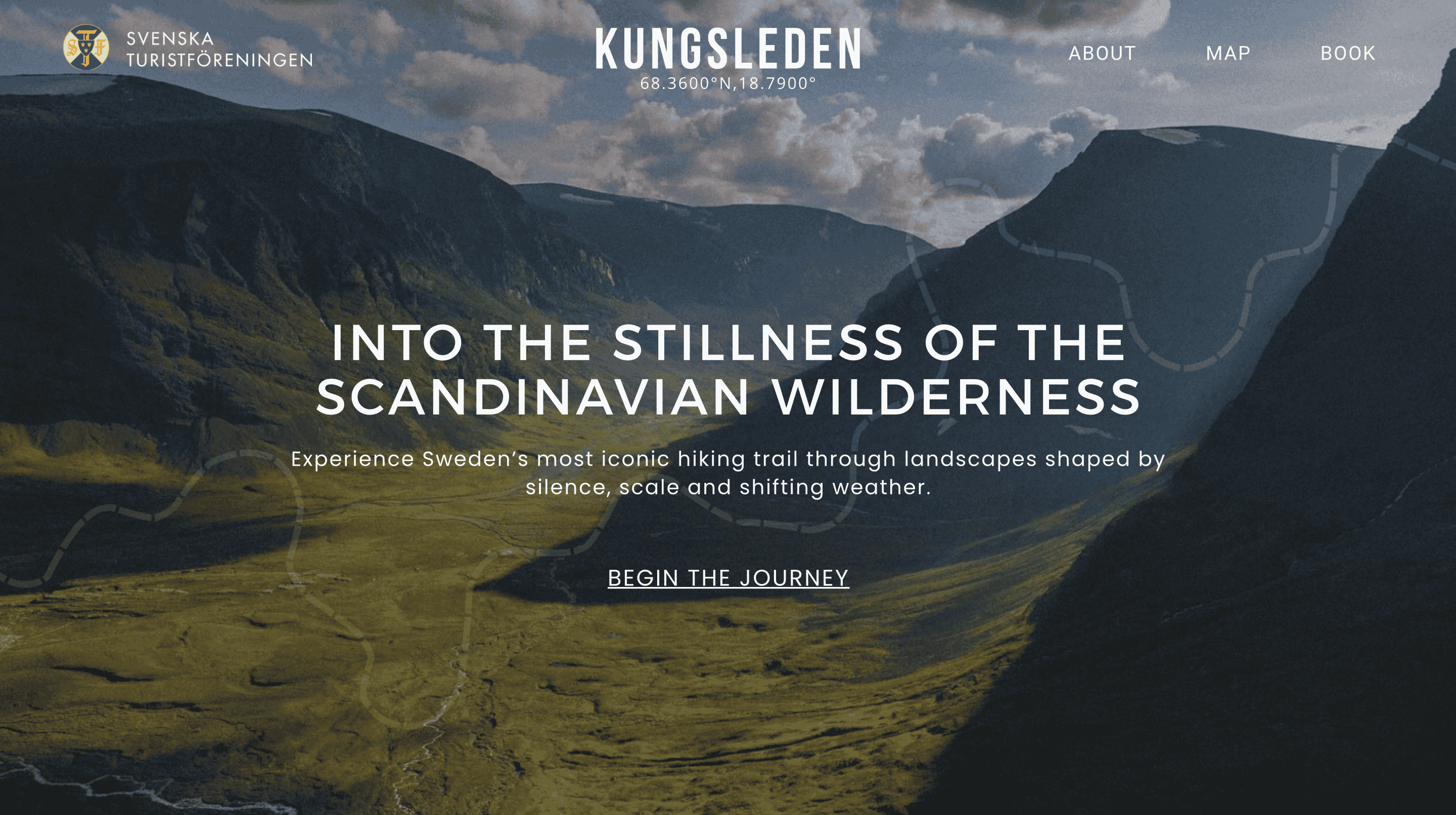
Kungsleden is Sweden's most iconic hiking trail, taking almost four weeks to finish completely. It snakes through northern Sweden's high mountains and deep valleys, where the weather changes drastically in seconds.I built a concept website for Kungsleden, featuring a minimalist layout and a large, high-quality image of the breathtaking surrounding carrying the atmosphere of the location.
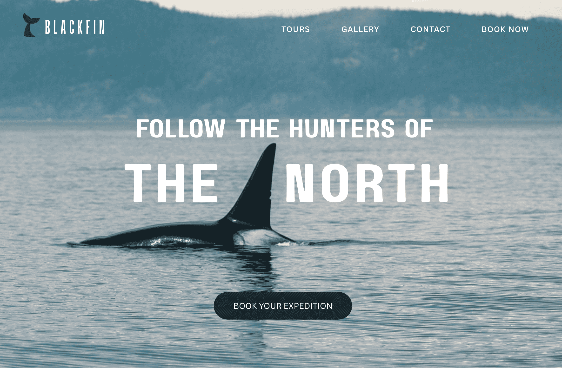
Blackfin is a company hosting orca-safari tours based out of British Columbia, Canada. Their website is centered around a striking, close up image of an orca with a cool color scheme, giving it a raw and dramatic vibe. The image is used as the foundation of the layout, using the orca fin as an anchor for the text.
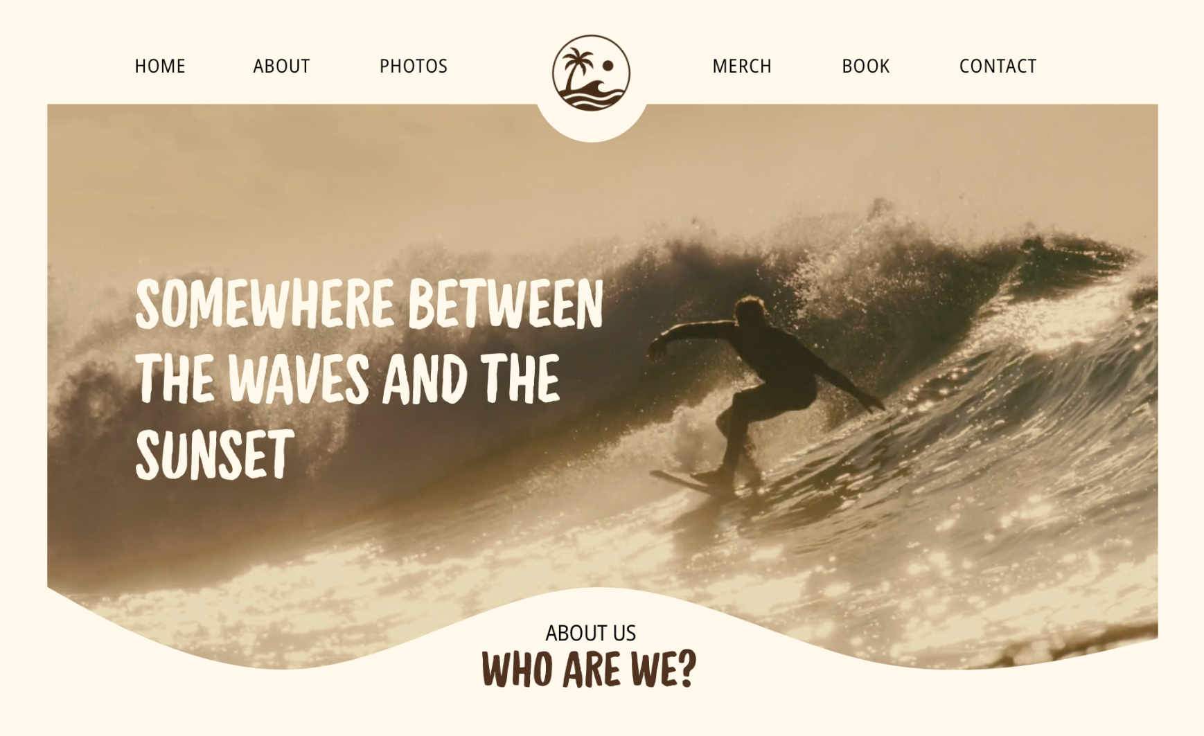
Helios Surf Camp in Portugal's website is built in a more playful way, using a casual font and warm colors, creating a tropical impression. The right centered surfer in the image is being supported by the left centered text, creating a beautiful visual balance. The cream-colored wave graphicon the bottom is further pushing the atmosphere in the "surfy" direction.
Kungsleden is Sweden's most iconic hiking trail, taking almost four weeks to finish completely. It snakes through northern Sweden's high mountains and deep valleys, where the weather changes drastically in seconds.
I built a concept website for Kungsleden, featuring a minimalist layout and a large, high-quality image of the breathtaking surrounding, carrying the atmosphere of the location.
Blackfin is a company hosting orca-safari tours based out of British Columbia, Canada. Their website is centered around a striking, close up image of an orca with a cool color scheme, giving it a raw and dramatic vibe.
The image is used as the foundation of the layout, using the orca fin as an anchor for the text.
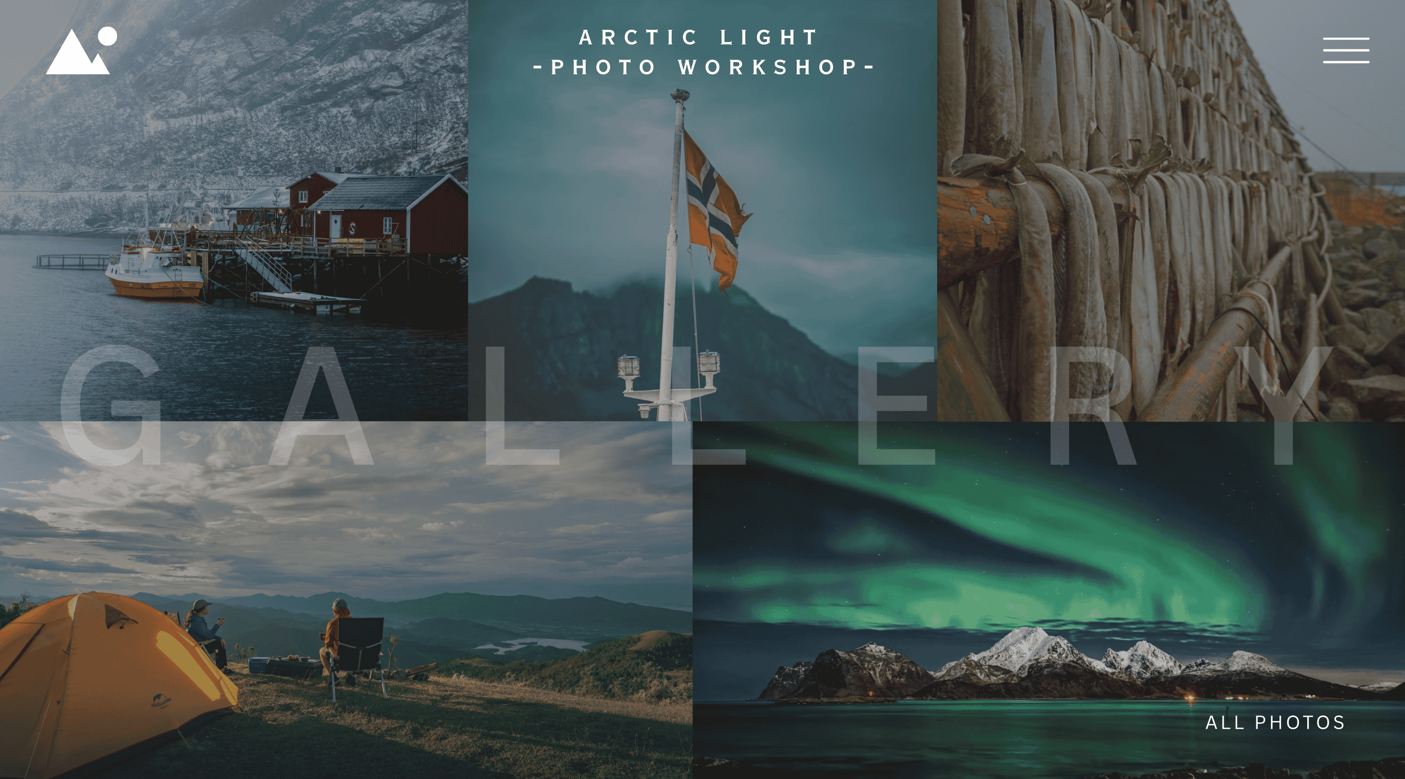
Arctic Light is a photography studio located in Lofoten. The page showcased is their photography gallery, featuring five images all taken in Lofoten.
To keep the focus on the visuals, a hamburger-menu is used in the top right corner instead of written page links, along with the company name and logo.
Helios is a surf camp concept built around warmth, movement and a more playful visual identity. The layout uses an off-center surfer composition, casual typography and a warm cream-and-brown palette to create a relaxed, coastal atmosphere.
Let's make the website feel like it.